5 Tips on How to Design the Best Logo for Your Business

[Banana bread in this post was made by Julie and is available for purchase via her Instagram account.]
Starting your own business or blog is a big step.
If you’re in the position where you’re about to launch your own baby then you already know there is so much involved with it. From the strategy to the social, there are a handful of things to get done that while it’s exciting, it can also be overwhelming. If you’re reading this post then there’s a solid chance that you’re ready to get your logo going and could use a bit of help along the way.
Sound like you?
Then grab a pen and paper or bookmark this post because it’s time to dive into five tips that will help you when it comes to designing your logo.
Want more blogging tips right in your inbox? Click here to get on the list!
Research What is Already Out There
One of the best ways to start designing your logo is to do research. This means seeing the types of logos that are out there, what a logo of those in your ideal business look like, and even seeing the look of your competitor’s logo. Does this take time? Absolutely. As someone who did it before starting FMG, I can honestly admit that it was the least exciting part of it all. To get started you can start by looking closely at logos that you see across social media, on television shows, clothing labels, in retail stores, and even within pages of magazines.
While I did get bored of looking at these places, it’s was the best way to determine how I would stand out. Doing this will show you what colors, symbols, styles, and impact others use in their own logos, and how you can create your own. If you’re in the food blogging world you may notice others use a lot of utensils, dishware, and even mouths. These happen to be common symbols that are easily connected to food, but in some ways they can become a crutch. If you’re a newer business starting out, you may want to look beyond the symbols that are frequently used to find something that won’t get easily misconstrued with others.
The best way to do this? You got it: research.
Choose Your Colors Wisely
While research is the least interesting part to me, picking the colors is my favorite part about designing a logo.
Choosing your colors means more than saying: “Insert random color is my favorite color.” The reason for this is because there is meaning to color and a purpose to why brands choose what they’ve selected. The psychology of color in branding is an incredible place to begin at looking into what color(s) to choose for your logo. What do you want to evoke to consumers through color? Do you select one color or a trio? Do you lean towards darker colors or a rainbow? And do you decide on secondary colors? There are often many questions that can seem like a lot to figure out, but there are answers to each of them. When you find out what they are, the closer you’ll be to selecting what’s best for you and your logo.
What Will it Be: A name, initials, symbol, or a combination?
The complex part about designing your logo is that it can be made in four primary ways. Your logo style options are:
- Wordmark: an all text logo comprised of all letters spelling out a word or name (ex: Coca Cola logo)
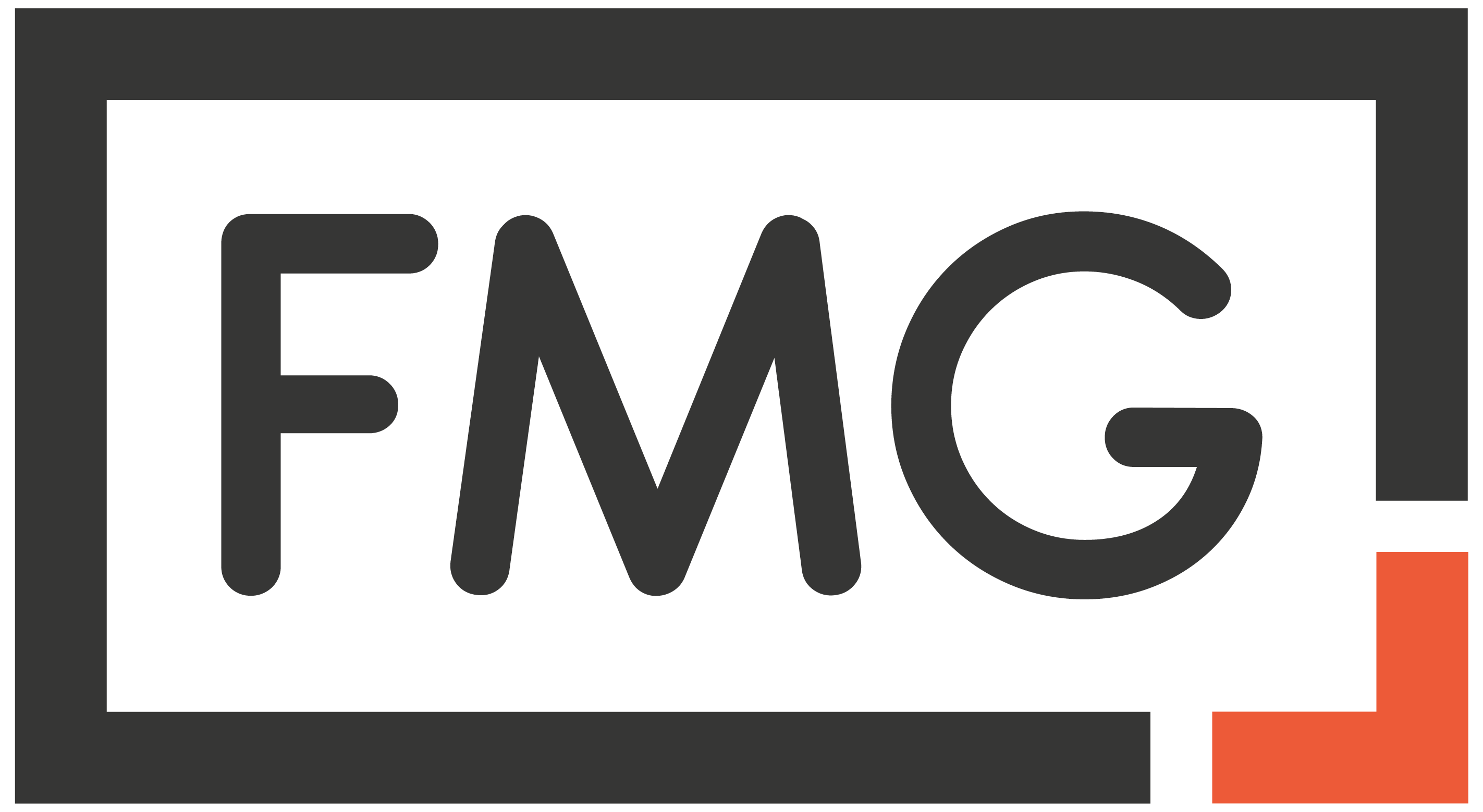
- Monogram: an all text logo comprised of initials or an acronym (ex: the current FMG logo)
- Brandmark: an image that represents the logo itself and can stand alone without text (ex: Pinterest logo)
- Combination: a logo that encompasses text and a symbol (ex: Adidas logo)
While you can always do one or a combination of all the above, the best part is knowing that it’s completely up to you. Design it how you want it, but it’s important to know that the more components you give to your logo the more effort you’ll need to put into creating it. Is it more work? Sure, but it can lead to having something beautiful.
Pick Your Font
Picking a font is one of those things that you don’t realize is important until it’s too late. If you don’t know much about them, you’re not alone. Most people really only know what they see in Microsoft Word – ahem, Times New Roman or Arial, anyone? Even if those are all you’re familiar with, then it’s important to look at them to find components that you like or dislike. Do you want a logo that has text that is more cursive or would you prefer that it be thick chunky letters? Are you interested in something no one else has or would you prefer something familiar? Looking through fonts that you see in Word and even in other logos is a great place to start and to get the ideas flowing. My all time favorite place to look over logos is at Design Cuts. The website sells fonts and they’re a great source of inspiration. Before you hop and copy something exactly, read over their rules and guidelines and then proceed.
Find Out Who Can Do the Job
Once you have done the research and have the aesthetic to your logo set, it’s time to find the person who can execute the job. If you’re unsure where to start here are my suggestions:
- Someone you know,
- A recommendation, or
- Fiverr
If you happen to know someone who can design a logo and you like both their work and their rates, go with them. Ideally, if you already have a rapport and trust with that person then handing the job to them should be a no brainer. If you don’t have a friend who is skilled at such design, then ask around. Make a post across your social media asking if anyone knows a designer they would recommend. Making the request via LinkedIn, Facebook, and Instagram are great places to start. Should you get a name or two, vet them out, and the proceed if it feels right.
Say you don’t know anyone personally and every suggestion you received through social media doesn’t pan out—that’s when Fiverr comes in. The website is great because it aggregates freelancers across the world who can complete a creative job that you have. In working with someone on the site, it’s important that you look over reviews, deliverables, and if they offer revisions (this is a big one). Once you find someone you like, seal the deal and get to work. You have a logo to get made!
Designing your logo may involve a lot of work, but it’s worth it. Creating something that makes you happy when you see it is essential. But here’s the best part about designing your logo: it’s your logo. That means you have the freedom to pick every part about it and the choice to reject anything you do not want. Use that to your advantage and design your logo in the exact way that you please. From the color to the font, each move is yours. Ideate and create it in that way and nothing less.
Share this:
- Click to share on Facebook (Opens in new window)
- Click to share on Twitter (Opens in new window)
- Click to share on Tumblr (Opens in new window)
- Click to share on Pinterest (Opens in new window)
- Click to share on LinkedIn (Opens in new window)
- Click to email this to a friend (Opens in new window)
- Click to print (Opens in new window)

Follow My Gut
Follow My Gut is a restaurant discovery blog created to help people find restaurants and indulge in food. There's great food in restaurants and those finds should be shared! If you feel the same way and want to join in new and forgotten discoveries, all you have to do is Follow My Gut by subscribing. You can also stay up to date on all food finds on Facebook and Instagram at @FollowMyGut!


