3 Tips on How to Rebrand Your Logo for Your Business or Blog

There comes a time when working on your business or blog where you realize you want to update to your logo. If that’s where you currently are, you’re not alone because I was there too. Earlier this year I made the decision to rebrand the website and updating the logo was a big part of it all. Making changes to the image that best identifies this blog with readers wasn’t a quick change, but one that needed to be done. In the process of rebranding my logo, I’ve learned a few things along the way. If you’re looking for the same help, I got you. Here are three ways to help you rebrand your current logo.
Do An Inventory of What Needs to Change
You know your logo better than anyone else which should  mean you know every part of it. From the colors, the ligatures (or absence of), shapes, symbols, character, etc. you know it well. Having spent so much time with it should also mean that you know which components you could live without. Maybe you’re not into the font as much as you thought or you could be wanting to incorporate color to stand out. In the start of rebranding your logo, look at what needs to be changed. Take every aspect of the logo into consideration to determine what you want to keep and what you want to change.
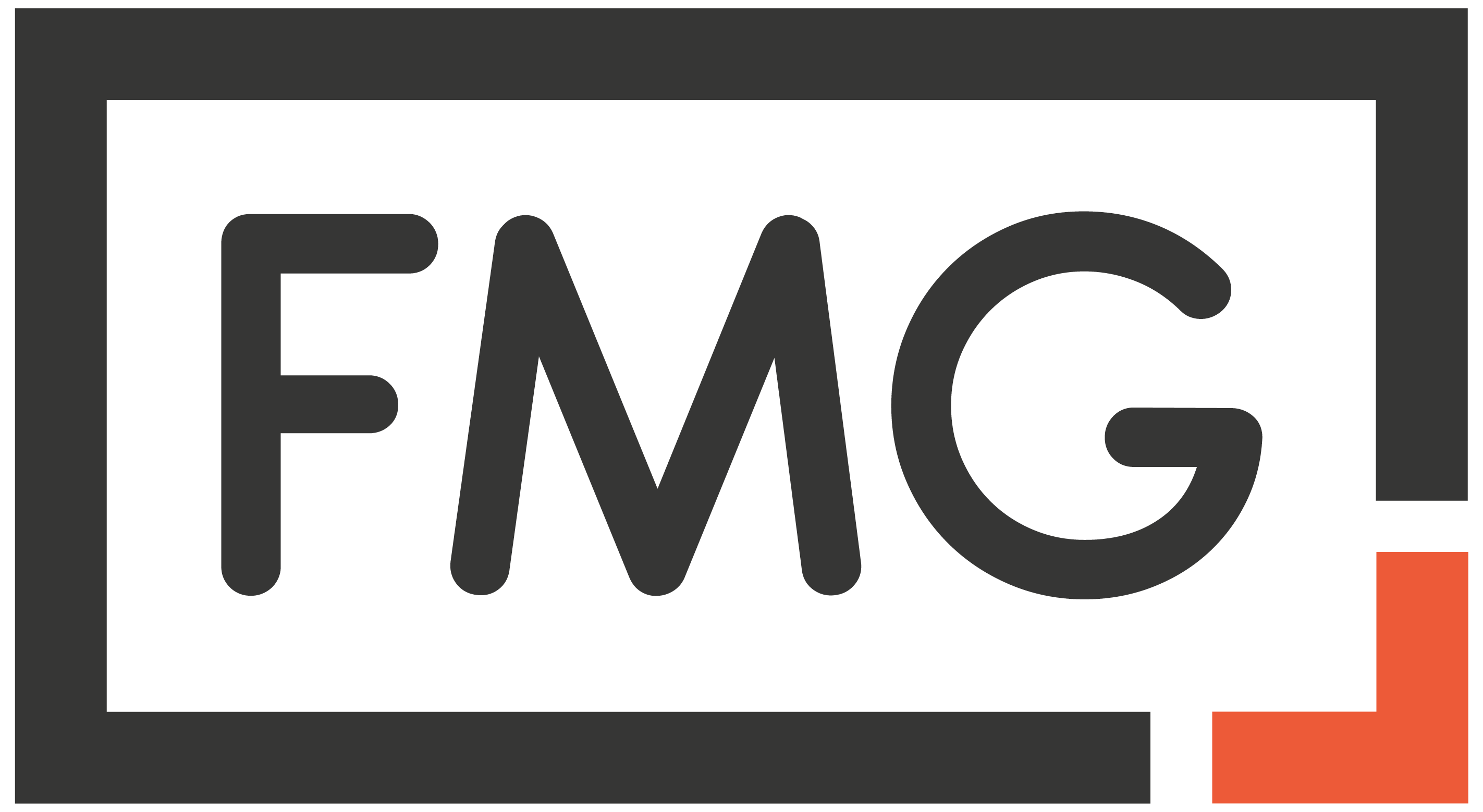
What I Changed: In looking at my old logo I felt like the food icons of a burger and beer glass were starting to seem childish. I also wanted something that didn’t take up so much horizontal space. A monogram logo with a hint of the signature deep orange color was something I wanted.
Look at Options
Having one signature logo for the length of your business or blog can be hard to step away from so looking at options can be helpful. If you’re creating your own logo or if you work with a designer, ask for options so you can really see what resonates with you. Often, we think a we want a certain look, font, or aesthetic but when you see it as a draft you’ll find that it really isn’t you. That make seem like it’s setting you back, but in fact it’s propelling you forward. Seeing options can help you rule out what you think you want and solidify what you actually love. 
My Options: Working with Darrin who designed my first logo, he gave me a few options. I was a bit indecisive, but after looking over a few of them for a few days I could start to decide what I liked. I would ask questions like:
- What could I see every day and still love?
- Which one would I be proud to have on a business card and hand to someone?
- Is there a logo here that seems timeless?
Would one stand out best if printed with other logos in my same industry?Asking those questions required me to be honest about what I wanted long term, where I plan to take my website, and how I want others to see it. I even showed some of the options to close friends who helped me make a final decision. Ultimately, you know which logo I went with, but to see the other contenders is still exciting.
Pull the Trigger
For some people (ahem, me) this the hardest part. You have a rebranded logo that you like and it hits home for you. You smile when you see it, it feels right, and you can’t wait to have it plastered on all of your pages and accounts. But you sit on it. You paid the designer and you’re just lingering with it on your computer.
Why you do it doesn’t matter, but the fact that you’re doing it is such a waste of time. Get over whatever may be holding you back and just get the new logo everywhere. Post it on your website, get your business cards made, and share it on your social accounts. Wherever your newly designed logo needs to live is where it should be displayed and holding on to it is doing nothing for anyone – you in particular. Share it and get it out there, you’ll be happy you did.
How long I waited: Like two months, but who’s counting. Whatever. Don’t judge me, the new logo is here. Mmmk cool.
When it comes to rebranding your logo, making changes can be hard. But if you take even these three simple steps to rebranding your logo, you’ll position yourself to create one that you love just as much as your original. Sure, the first one was great and can never be forgotten, but an update is welcome whenever that time comes for you.
Share this:
- Click to share on Facebook (Opens in new window)
- Click to share on Twitter (Opens in new window)
- Click to share on Tumblr (Opens in new window)
- Click to share on Pinterest (Opens in new window)
- Click to share on LinkedIn (Opens in new window)
- Click to email this to a friend (Opens in new window)
- Click to print (Opens in new window)

Follow My Gut
Follow My Gut is a restaurant discovery blog created to help people find restaurants and indulge in food. There's great food in restaurants and those finds should be shared! If you feel the same way and want to join in new and forgotten discoveries, all you have to do is Follow My Gut by subscribing. You can also stay up to date on all food finds on Facebook and Instagram at @FollowMyGut!

This Might Be the Perfect Pastrami Burger in South Los AngelesOctober 24, 2020
My Tried and True Ways to Set Your Goals and Accomplish Them October 24, 2020

1 Comment
Comments are closed.

I actually like the logo with a fork and the red lips. I know you think mouths are overused, but the mouth also represents talking, which you like to do. You give your opinion, share stories, rant, ideas, etc.